Denver Zoo: Redesign
Redesigning ticket flow to reflect conservation values and make planning effortless.

The Run-Down
The Denver Zoo Conservation Alliance, is a non-profit organization that provides a multifaceted experience with a dedication to conservation efforts.
This case study aims to improve the Denver Zoo’s online presence to accurately reflect their values, while giving zoo-goers an approachable way to plan their trip.
KC Yeneza, UX Designer
What I did in 4 months:
Researched similar organizations to understand efficient and educational methods in a website.
Conducted user-interviews to analyze issues within the current experience.
Designed a revised web-layout to address user concerns and define organization values.
Our Scenario
All adventures start with planning. The process of booking tickets should feel efficient and leave zoo-goers excited for their trip.
However, the Denver Zoo's current experience faces issues with outdated visuals and a time-consuming purchase flows, leaving customers discouraged.
Their desktop website required a shift towards an organized container for all of their information.
Problem Statement
Zoo-goers need a clear and efficient online ticketing experience, allowing them to feel confident planning their next adventure on the Denver zoo’s website.
Getting to know our audience
Research Challenge: Each commerce website implements different features in hopes of creating an efficient experience for customers, while emphasizing company values.
Approach: To assess the value in upgrading the Denver Zoo’s website, I conducted a series of five user-tests. Further, I researched competing companies to determine possible features to enhance the experience.
Current Experience


What questions did the interview ask?
“What do you expect to happen if you click on “view calendar” under General Admission?”
“What, if anything is unclear or confusing?”
“What information, if any, is missing from this page?”
What our users had to say


Meet our Users
1. Family Planner Parent
Name: Maria Gonzalez
Age: 38
Occupation: Middle school teacher
Tech Comfort: Moderate
Visit Context: Planning a weekend trip with kids
Goals
Book tickets quickly while juggling kids’ schedules
Ensure smooth entry with mobile tickets
Frustrations
Long checkout processes make her lose patience
Confusing site menus or hidden discounts
Wants assurance tickets are secured before the kids get restless
Quote
"I just want to buy tickets for the whole family in one easy step without clicking around forever."
2. Young Professional Day-Tripper
Name: Jordan Kim
Age: 27
Occupation: Marketing coordinator
Tech Comfort: High
Visit Context: Planning a casual outing with friends
Goals
Buy tickets instantly on mobile
Experience the zoo without hassle
Frustrations
Outdated visual design feels untrustworthy
Hidden navigation for hours/events
Doesn’t want to create an account just to buy one ticket
Quote
"If it takes more than a couple of taps, I’ll just skip it."
Pain Points
Long process to get tickets
The calendar feature is confusing
“Get tickets” on homepage lots of random info on the main page
Left guessing on where in the purchase process they were
Through conducting these interviews, I found opportunities in updating the ticketing process, time picker, and overall layout to give the website clarity.
Competitive analysis
I also found that a lot of the features on the Denver Zoo website and competitors shared a lot of similarities.
With the competitive research, I was surprised to see major companies making the process inefficient for customers.

"How Might We" statements
How might we use online platforms to make ticket purchasing more efficient?
How might we make customers feel confident using our website to purchase tickets?
How might we guide customers in navigating information on our website?
User Flow
By eliminating redundant steps in purchasing a ticket and reordering the process, zoo-goers will enjoy a seamless experience that enhances their overall visit.

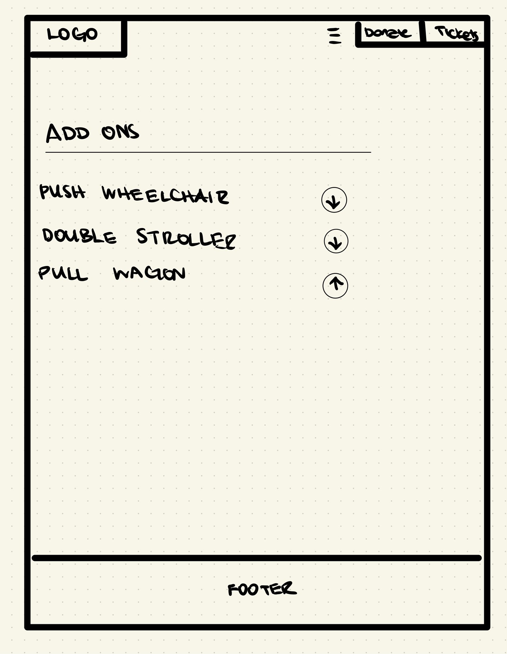
Low Fidelity Wireframes
The goal was to identify the most intuitive way for users to select a date, choose ticket types, and complete checkout with minimal friction.
This step was crucial in aligning the design around core functionality.


Mid-Fidelity Wireframes
My focus was to validate layout consistency, content hierarchy, and early interaction elements like buttons, forms, and navigation.


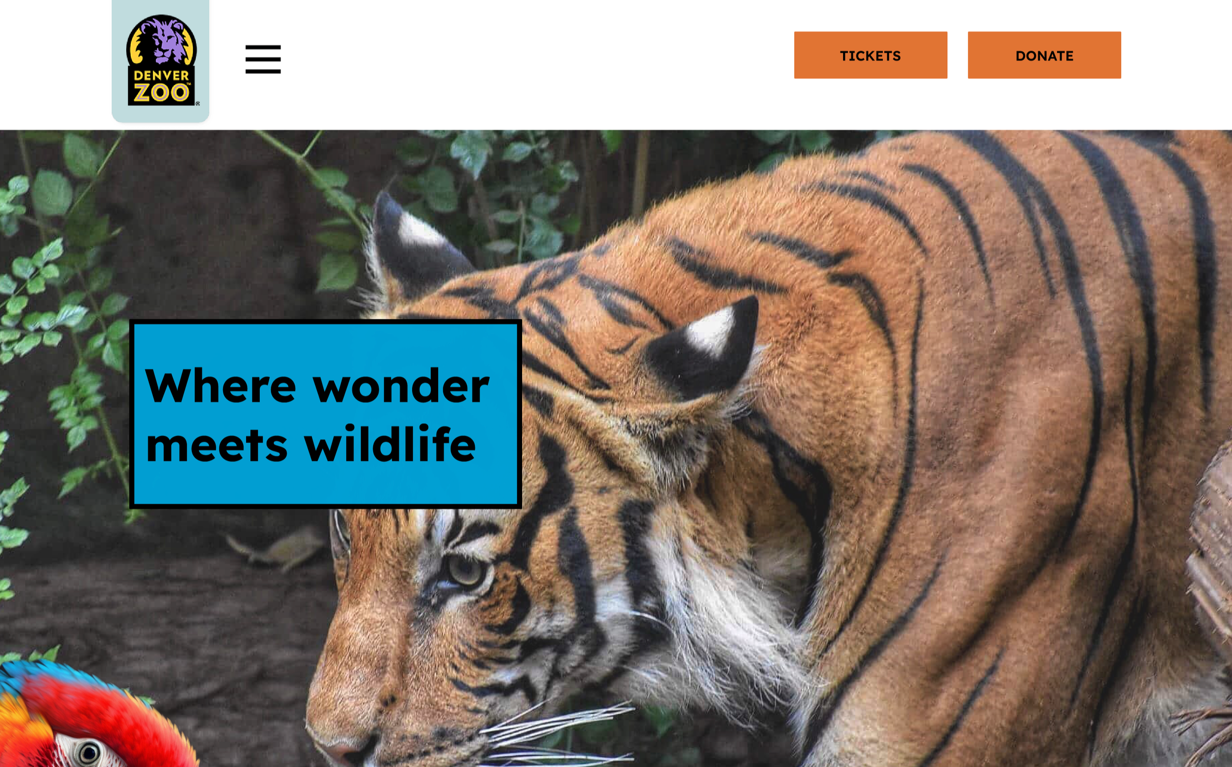
High-Fidelity Wireframes
Building on the previous iterations, I enhanced content visibility and reinforced the zoo theme.


User Testing
During prototype interviews, users responded positively to the cleaned up layout and progress bar but raised concerns around ticketing clarity, button confusion, and footer alignment. Specifically, users struggled with understanding the ticket dropdown, found duplicate buttons on checkout (“continue” vs. “checkout”).
I updated the following in my prototype:
Changed any dropdown menus to have “+” icons instead of using arrows.
Enforced a consistent font throughout the website
Removed redundant buttons through the checkout process
Aligned the footer to frame the site
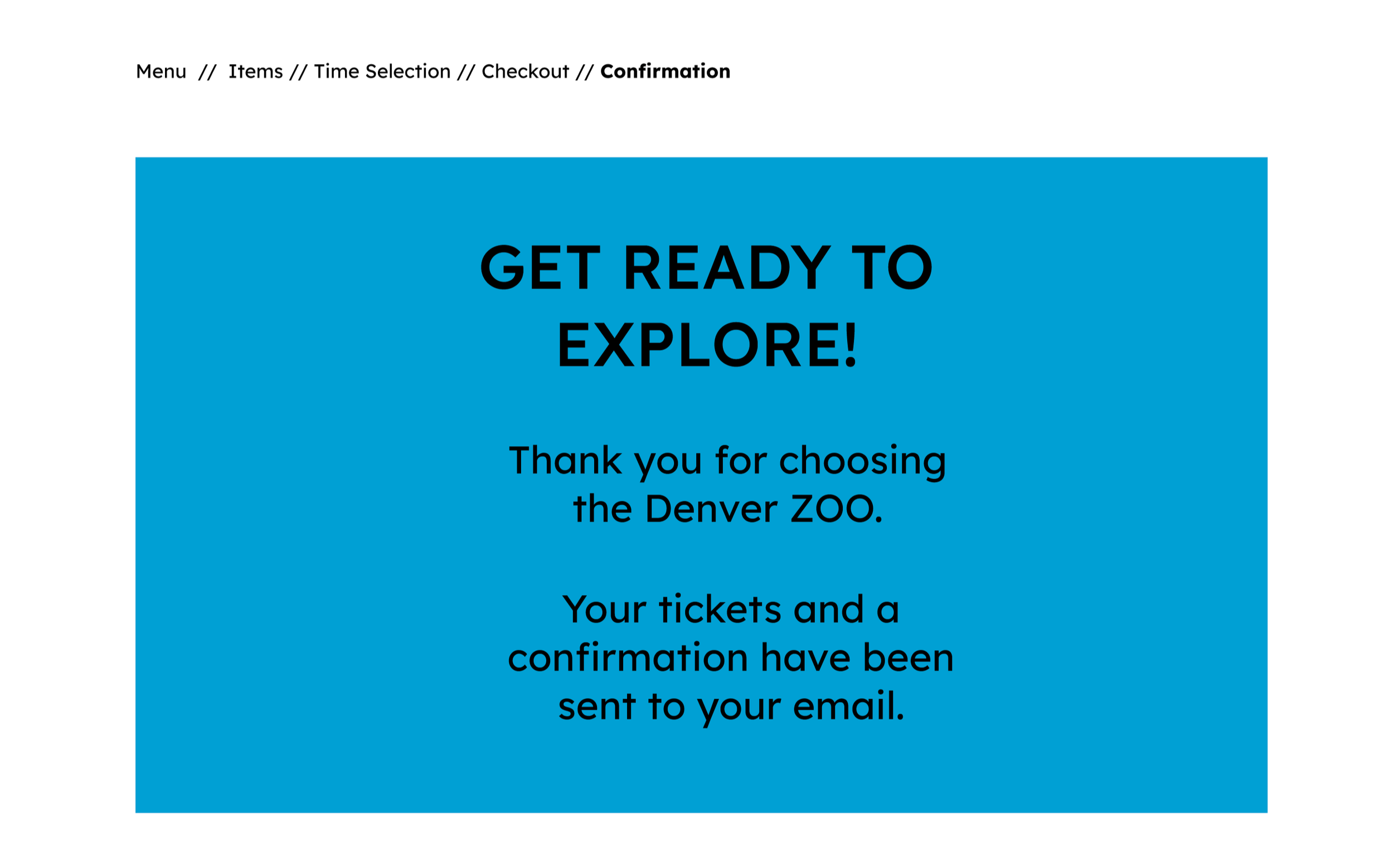
Final Prototype
This interactive prototype showcases the redesigned shopping experience. Explore it below to see the improvements in action.
Takeaways
Guide users through the journey. Breaking tasks into steps and using a progress indicator reduced uncertainty and made the flow more intuitive.
Reinforce visual cues. Icons alone weren’t enough; pairing them with text or tooltips improved discoverability and comprehension.
Iterate early and often! Prototype testing revealed subtle but impactful improvements. Gathering feedback often allows your design to move forwards with users in mind.