Dollskill: Website Redesign
“How might we make Dolls Kill’s edgy fashion accessible and inclusive while maintaining its brand identity?”
The Run-Down
Dolls Kill spotlights a collection of odds and ends for consumers who enjoy trendy street style. However, they fail to consider translating their brand to fit a wider audience.
This UX case study aims to organize the contents for an online retail platform, while maintaining brand identity.
KC Yeneza, UX Designer
What I did in four months:
Audited the current experience to assess how inclusive design and storytelling are integrated across fashion websites.
Spoke with real users to uncover challenges, especially around accessibility, representation, and ease of navigation.
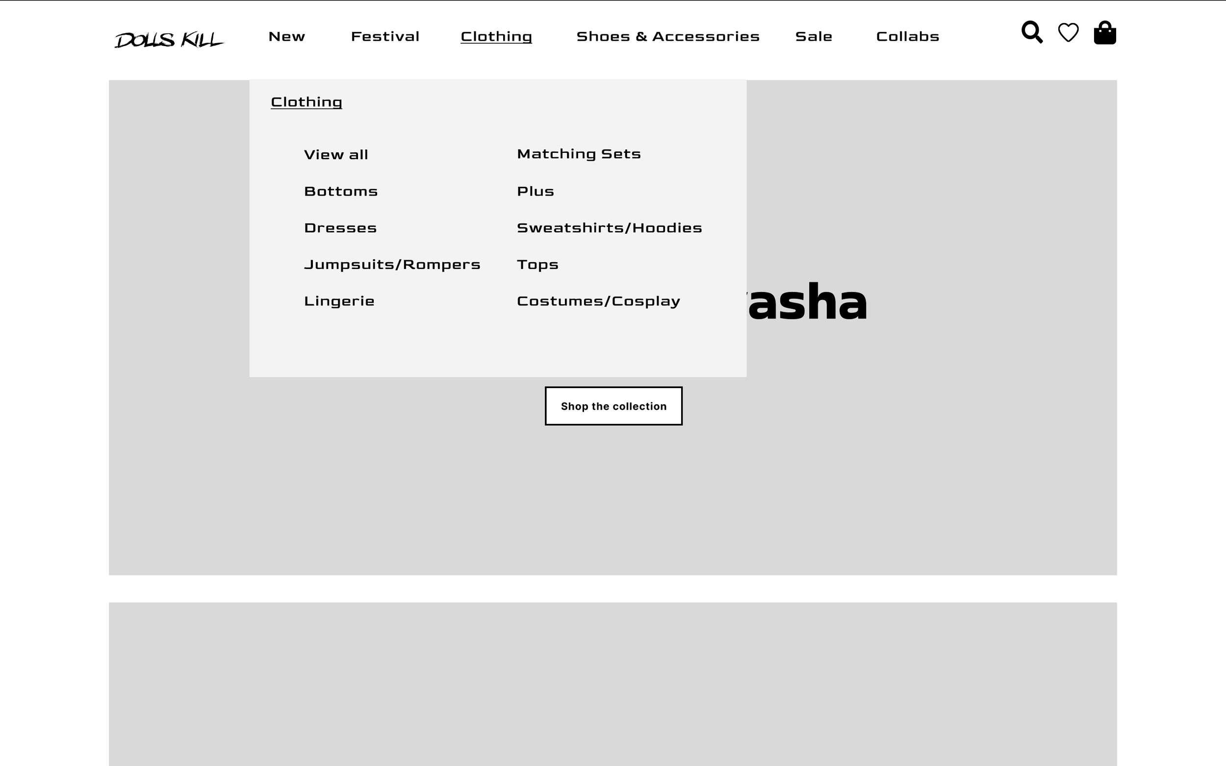
Redesigned the site layout using wire framing and Figma, with an emphasis on simplified UX, and inclusive website standards.
Our Scenario
I collected data through user research and assessed key areas of opportunity by screening the current experience, and carried out a redesign of the website which resulted in the final iteration.
My objective with this project was to manage Dolls Kill’s influx of content, by simplifying category navigation and pages, therefore improving accessibility.
I encountered challenges in maintaining brand identity however, designing an inclusive experience was my ultimate priority.
Defining our problem statement
“How might we make Dolls Kill’s edgy fashion accessible and inclusive while maintaining its brand identity?”
Understanding User Pain Points
This process found several inconsistencies on Dolls Kill’s website, including:
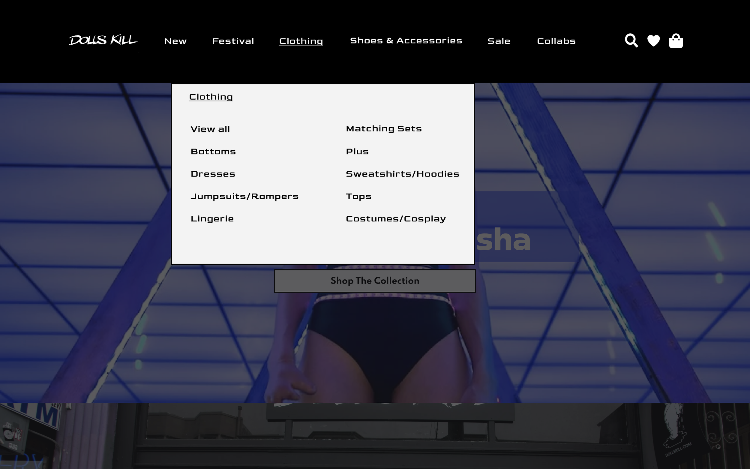
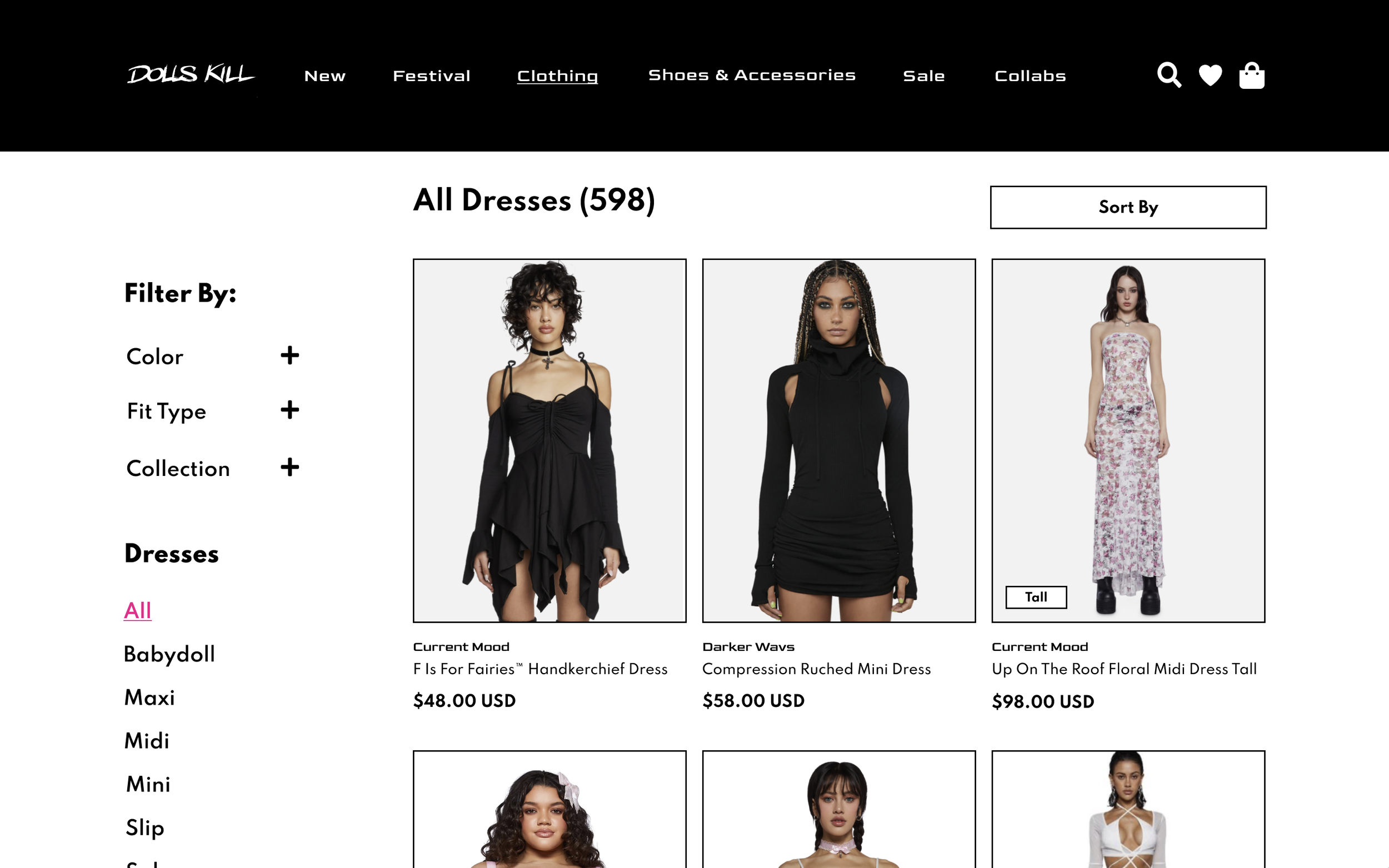
Overly busy menus and cluttered pages
Non-contrasting colors that affect readability
Limited consideration for inclusive design and accessibility
These issues created friction for users, particularly those looking for a more streamlined and accessible shopping experience.
I first screened their experience using a website audit framework, designed in collaboration with an expert in the field, to evaluate the site’s performance and user experience.
Meet Our Users
Persona 1: Alternative Fashion Enthusiast
Name: Alex, 24
Occupation: College Student
Goals:
Express individuality through edgy fashion
Discover unique, limited-edition items
Frustrations:
Difficulty finding size-inclusive options
Busy menus make navigation confusing
Checkout process feels overwhelming
Quote:
"I just want to shop without hunting for my size or getting lost in endless menus."
Persona 2: Budget Shopper
Name: Taylor, 28
Occupation: Entry-level professional
Goals:
Quickly locate deals and favorite items
Compare products easily
Frustrations / Pain Points:
Overwhelmed by visual clutter on product pages
Hard to filter by size or availability
Checkout process has too many steps
Quote:
"I don’t have time to figure out what’s in stock. I just want to buy it fast."
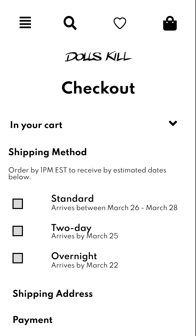
Single-Track Flow
This would allow consumers a more efficient way to checkout. However, the purchasing flow wasn't the biggest concern with Dolls Kill's website, and the layout of their pages needed some rethinking.
Low-Fidelity Prototypes
I made some sketches through the app GoodNotes on an iPad, and mapped out the pages to model the screens for desktop and mobile. I was determined to create a simplified layout that prioritized their products, as well as their consumers.

Mid-Fidelity Wireframes
Here, I was able to bring my vision to life. This further mapped out the updates I wanted to implement, introducing different fonts and sizes, placements of images and buttons, and finally creating a more communicative prototype for others to view.
Desktop


Mobile


Expert Feedback
After receiving instructor feedback I synthesized the following pain points:
-increase text size for both mobile and desktop screens
-increase the visibility of the functions of buttons
-Improve visibility of inclusive sizing

Increased text size on both mobile and desktop. Disregarded grey fill color to indicate action for the user.

Decreased the circle size to indicate a swipe feature, rather than clickable buttons.

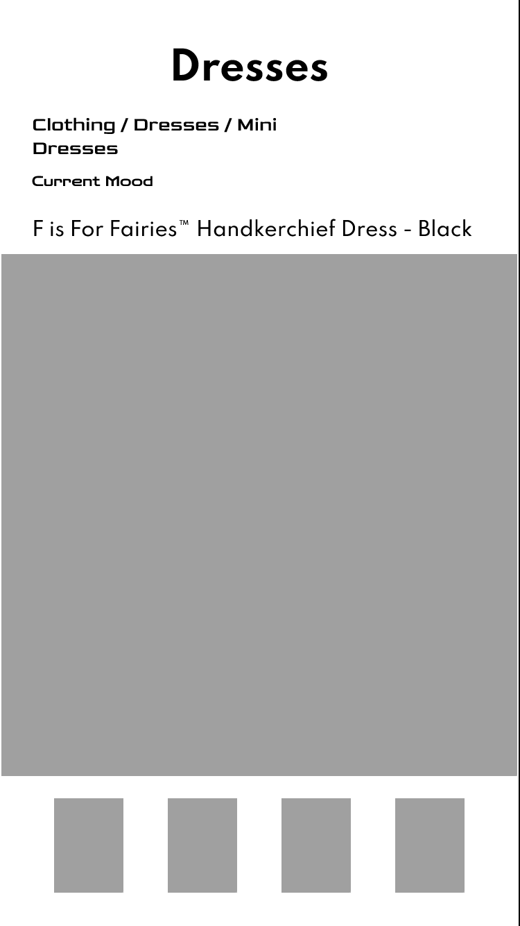
Designed fit badges to help users quickly identify an item’s fit.
Implemented a ‘Fit Type’ filter to improve product discovery, allowing users to sort items by their desired fit.
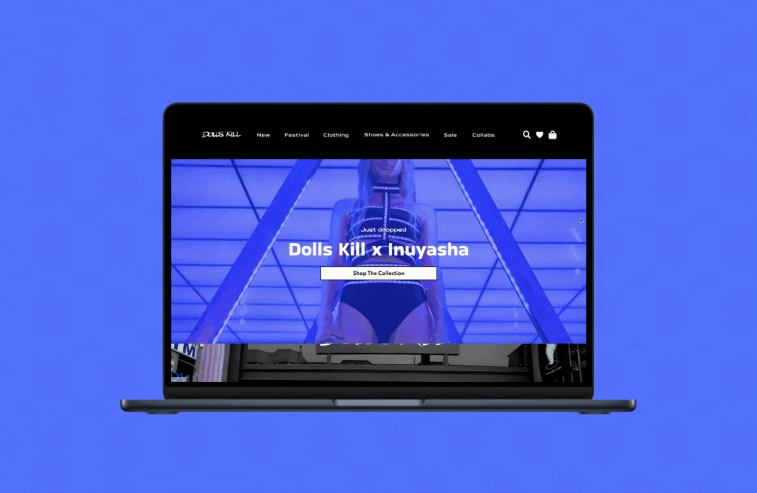
Final Prototype
This interactive prototype showcases the redesigned shopping experience. Explore it below to see the improvements in action.
Design Library

Takeaways
This experience taught me how to mix aesthetic with designing products that are inclusive of a larger audience. I was surprised at the easy changes that could be made to reach this goal.